About us
Architectures
The Banco de España's most important heritage is unquestionably its buildings, often amongst the most outstanding architectural spaces in their respective host cities. For over two centuries, the bank has been firmly committed to creating its own architectural heritage, epitomising both its strength and its commitment to the art of its time.
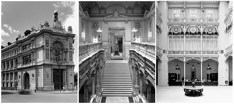
Two clear examples are the bank's offices in Madrid. The head offices on Paseo del Prado, opened in 1891![]() , occupy a building that audaciously and elegantly combines the two chief functions of the establishment —industrial and representative— and it has often been described as one of the jewels of Spanish nineteenth-century architecture. Designed by Eduardo Adaro
, occupy a building that audaciously and elegantly combines the two chief functions of the establishment —industrial and representative— and it has often been described as one of the jewels of Spanish nineteenth-century architecture. Designed by Eduardo Adaro![]() and Severiano Sainz de la Lastra
and Severiano Sainz de la Lastra![]() , it has undergone several extensions, most recently by the Navarrese architect José Rafael Moneo
, it has undergone several extensions, most recently by the Navarrese architect José Rafael Moneo![]() .
.
In 1992 the bank opened its second Madrid office, designed by the firm Corrales y Molezún![]() . The building is overwhelmingly governed by principles of hierarchy, symmetry and proportion and it forms an austere block, with a strikingly horizontal composition.
. The building is overwhelmingly governed by principles of hierarchy, symmetry and proportion and it forms an austere block, with a strikingly horizontal composition.


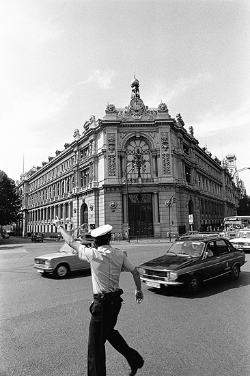
Edificio Banco de España series (2000-2001). Photographs by: Javier Campano
Erected at the height of the nineteenth-century architectural boom, few buildings in Madrid have evolved as successfully and with such consistency as the Banco de España's head offices in its iconic setting on the Plaza de Cibeles. The design was approved at the end of 1883 and the first phase of building work was completed in 1891. The chief architect was Eduardo de Adaro![]() , assisted by Severiano Sainz de la Lastra
, assisted by Severiano Sainz de la Lastra![]() and, following the latter's death, by José María de Aguilar y Vela
and, following the latter's death, by José María de Aguilar y Vela![]() .
.
Overcoming many construction difficulties, they managed to create what is unquestionably one of the most powerful examples of Spanish architecture of the time. As Pedro Navascués Palacio writes, within the monumental edifice, the architects managed to reconcile the industrial and representative functions of the bank with a great sense of naturalness and fluidity. This synthesis is visible not only in the structure, but also in the ornamentation, and was one of the grounds for the building's listing as a Site of Cultural Interest in 1999, in the historical monument category.
Since it was first erected, the building has undergone a complex evolution. Most recently, in 2006 (coinciding with the 150th anniversary of the foundation of the Banco de España under its current name), architect Rafael Moneo![]() , winner of the prestigious Pritzker Prize, closed the block with a new free-standing corner building, designed to house meeting rooms and an auditorium. The meticulous intervention
, winner of the prestigious Pritzker Prize, closed the block with a new free-standing corner building, designed to house meeting rooms and an auditorium. The meticulous intervention![]() respects the existing structure, while at the same time enhancing the entire complex.
respects the existing structure, while at the same time enhancing the entire complex.
In all, four separate construction phases can be identified, with gaps of thirty-six, thirty-eight and twenty-eight years between them.
The first extension, approved in 1927, was designed by José Yarnoz Larrosa![]() who built the façade on Calle Alcalá in keeping with the historicist idiom of the original design. Inside, his intervention was more ground-breaking; he replaced the Cash Hall with the great art deco Trading Hall
who built the façade on Calle Alcalá in keeping with the historicist idiom of the original design. Inside, his intervention was more ground-breaking; he replaced the Cash Hall with the great art deco Trading Hall![]() , which stands above the famous Gold Chamber. The second extension, begun in the mid-1960s, was the work of Javier Yarnoz Orcoyen
, which stands above the famous Gold Chamber. The second extension, begun in the mid-1960s, was the work of Javier Yarnoz Orcoyen![]() , son of the architect in charge of the earlier alterations, and closed off the building on Calle Madrazo and Calle Marqués de Cubas.
, son of the architect in charge of the earlier alterations, and closed off the building on Calle Madrazo and Calle Marqués de Cubas.
The successive interventions have not deprived the building it of its great uniformity of style, while still offering fine examples of the contemporary architectural culture of each period. As a result, the Banco de España’s head office, begun in the late Romantic age and completed in the democratic period, remains one of the most iconic public buildings in Madrid.
The ornamentation is particularly striking. Outside, the sculptural and relief features that decorate the façades of the original building sit harmoniously alongside those of later extensions. In the interior, there are a number of outstanding highlights from the original design, including the Grand Staircase in Carrara marble; the Cash Hall or main banking hall, now the Library, whose cast iron structure, like most of the metal components used, was made in the Mieres Factory; and the set of symbolist stained glass windows![]() , made by the House of Mayer in Munich. Also notable, from Yarnoz Larrosa's design, is the new Trading Hall, with its attractive art deco features such as the upper stained glass window
, made by the House of Mayer in Munich. Also notable, from Yarnoz Larrosa's design, is the new Trading Hall, with its attractive art deco features such as the upper stained glass window![]() and the clock
and the clock![]() presiding over the courtyard.
presiding over the courtyard.
The building has been the subject of a number of essays by experienced architectural photographers Javier Campano, Candida Höfer and Jorge Ribalta. Campano's series Edificio del Banco de España (2000-2001) comprises over 150 photographs, some of which have since become iconic images of the building. Also dating from 2000 is a project by German photographer Candida Höfer, one of the leading figures in the Düsseldorf School. In her exploration of what has been called the "architecture of absence", Höfer depicts a number of areas inside the building, including the former historical archive and the lobby leading to the vault elevators. The most recent project, by Barcelona photographer Jorge Ribalta, is a series entitled Restauración, which documents the work of restoring and cleaning the building in 2017 and 2018. The series is also a multifaceted exercise in metalinguistic reflection on the photographic device itself, the genesis and history of this architectural space and the relationship between money and photography.

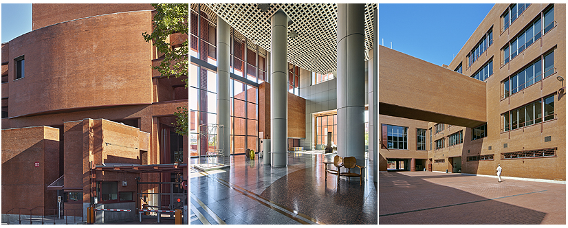
Banco de España, building at Calle Alcalá 522 (2020). Photographs by Fernando Maquieira
Opened in 1992, the new building at Calle Alcalá 522 was designed to help free up space at the Banco de España's Madrid headquarters. It has a floor area of approximately 70,000 square metres (750,000 sq. ft.). The design by José Antonio Corrales![]() (b. Madrid, 1921) and Ramón Vázquez Molezún
(b. Madrid, 1921) and Ramón Vázquez Molezún![]() (b. A Coruña, 1922) is one of the finest illustrations of the two architects' principles and ideas. It was also their last joint commission.
(b. A Coruña, 1922) is one of the finest illustrations of the two architects' principles and ideas. It was also their last joint commission.
Architecturally, it is an austere building, with a strongly horizontal composition, qualified by the curved lines of some of the panels which are used to highlight the entrances and a number of key features in the building.
It consists of two blocks —one running parallel and the other perpendicular to Avenida Aragon— linked by a large central courtyard open on two sides. The main façade contains a series of large porticoes flanking a central block, the upper section of which is convex, housing a spacious auditorium. The screen walls at the sides, broken up with vertical apertures, serve as paths of transmission between the exterior and interior.
Corrales and Molezún were very familiar with the expressive values of form and matter and endowed the design with a rich play of volumes, enhanced by extensive use of brick facing. This is particularly visible in the outer galleries, the skylight-covered atriums, the latticework and the entrance ramps.
Inside, the spacious entrance hall and preceding portico are particularly outstanding. The use of brick and steel plate lends a grey tone to these areas which successfully complements the sculptures by Pablo Palazuelo and Jorge Oteiza. Oteiza's In Praise of Discontent (1991) presides over the atrium and is an excellent example of the bank's growing interest in creating a dialogue between the works in its collection and the different architectural spaces.